The Psychology of Fonts: How Typography Shapes Perception
Now I am neck deep into my dissertation; the idea of setting a font has sprung to mind. My standard font is Arial, Futura or the new Aptos. But could there be one that helps the reading flow better? When setting out plans the font is paramount in the whole overall design.
Fonts are more than a design element; they’re a psychological tool that influences how we perceive and interpret information. Reading into font psychology it reveals how different typefaces evoke emotions, shape branding, and guide decision-making.
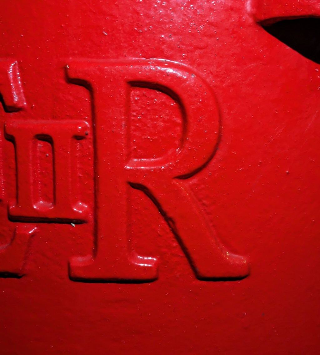
Fonts can communicate personality. For instance, serif fonts like Times New Roman are often associated with tradition, authority, and reliability, making them ideal for legal documents or prestigious publications. In contrast, sans-serif fonts like Arial or Helvetica convey modernity and clarity, frequently used in tech or minimalist designs.
The emotional impact of fonts is profound. Rounded fonts, such as Comic Sans, can feel friendly and approachable, while angular typefaces like Futura may appear bold and assertive. Even subtle differences, such as kerning or weight, affect readability and mood.
Font choice also influences trust and engagement. Studies have shown that readers are more likely to trust content presented in professional, clean fonts over informal or overly decorative ones. Similarly, the readability of a font impacts how long someone stays on a page or whether they act on a call-to-action.
Therefore, being able to understand font psychology should help me craft messages that resonate emotionally, visually, and intellectually with my audience. Fonts, after all, don’t just communicate words—they tell a hidden message.

Leave a comment