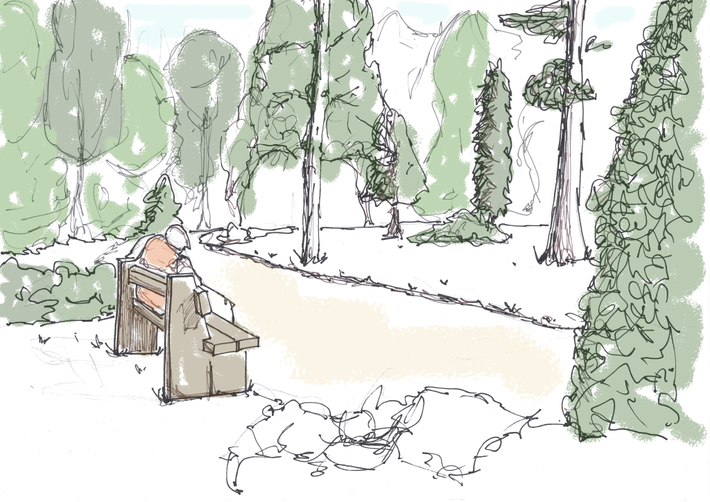
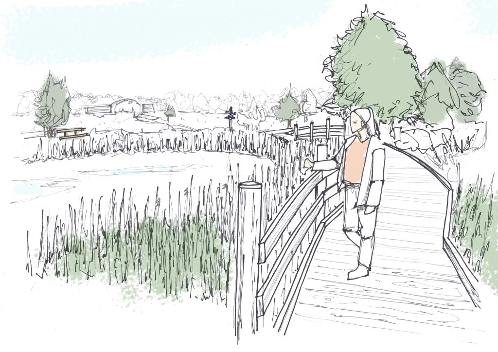
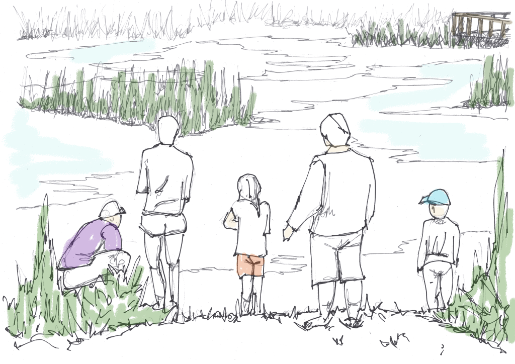
Here are a few of my sketch visualisations. I feel they successfully capture perspective, depth, and movement, creating a dynamic composition. By limiting the colour palette to just five shades across all sketches, I think I have established a cohesive and stylised theme.
However, I feel they could be improved, though I’m not entirely sure in what way. It might be the rendering technique, perhaps a more refined approach, such as a single-line sketch with bucket-filled colour blocks, would create a cleaner, more professional look.
For these sketches, I used a reduced-opacity pastel effect. While this technique is effective, I wonder if it appears too simplistic. Exploring alternative methods, such as stronger contrast or sharper linework, might enhance the final presentation.
I am not yet confident in my sketching or rendering skills, so one of my key goals this semester is to experiment with different techniques and refine my visual communication style.

Leave a comment