I’ve been working on re-rendering a plan for my design project module, and decided early on that I wanted to try a realistic collage-style approach using real imagery to build up the landscape. I was drawn to the idea because it felt more tactile, atmospheric, and personal than traditional vector or illustrative styles.
Initially, things started well. Elements like the water and some of the smaller landforms came together in a way that felt successful and in line with my original vision. But as I progressed, I quickly ran into the limitations of both the technique and my own skills.
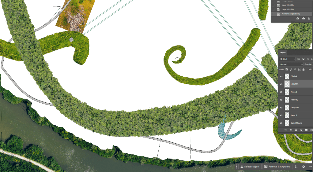
One of the biggest challenges has been blending the imagery in a way that feels cohesive. I had a strong idea of how I wanted the plan to look, but getting different photographic textures to merge convincingly has proven harder than expected. It’s pushing my software skills right to the edge in some cases.
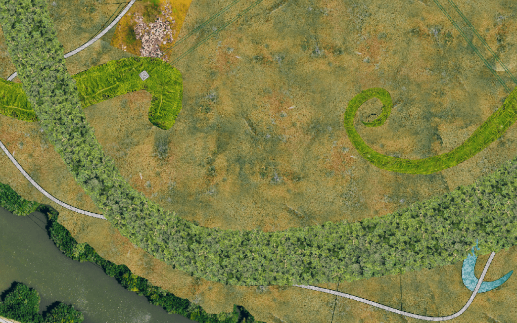
I’ve also been trying to maintain a sense of realistic scale throughout the drawing, ensuring that trees, paths, and terrain features relate correctly to the drawing’s scale. But it’s difficult to balance visual richness with technical accuracy, especially when sourcing images from different places.
The meadow area has been particularly frustrating. Every time I try to drop it in, it just becomes a flat green mass. It doesn’t help that I expected this technique to be fun and expressive, but right now it feels more like a technical puzzle I can’t quite solve.
So now I’m at a bit of a crossroads. Do I abandon the technique and start over with a more manageable visual style, or persevere and try to push through the rough patch?
At this point, I’m giving myself a short (and with the deadline looming, time i cannot waste) window to experiment further, maybe a couple of hours to try new blending methods, adjust scale markers, and add visual layering. If that works, I’ll stick with it. If not, I’ll reframe the collage as an early-stage visualisation and use a different technique for the final submission.
These moments are part of the learning curve, uncomfortable, but often sadly necessary. Whether or not this version of the drawing makes it into the final submission, the process has already taught me a lot about realism, digital composition, and the importance of flexibility in design.
*UPDATE*
I cut my losses!
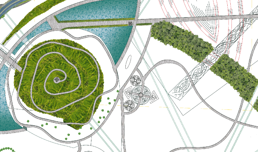
I felt like I had hit a wall with my previous design render, and I couldn’t shake the feeling that it resembled Cogsworth from Beauty and the Beast.

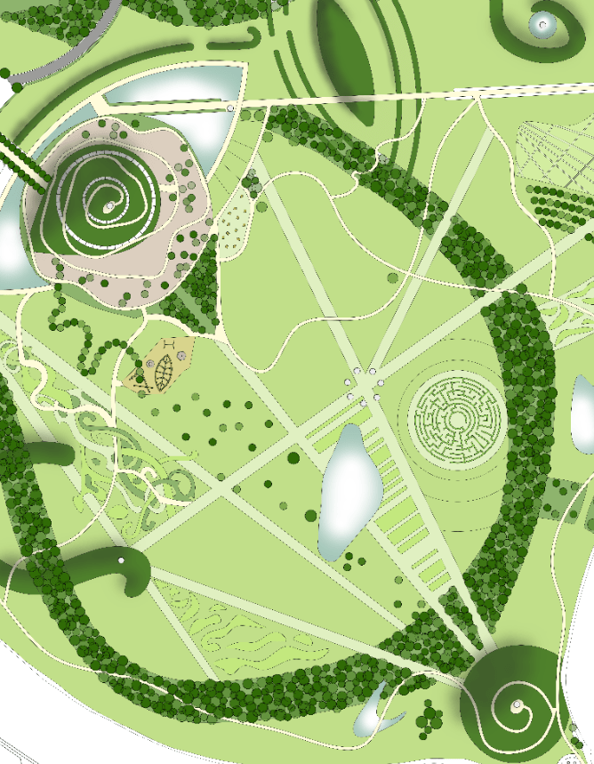
So, I decided to return to my original concept and revisit what was truly important in the design, what I wanted to convey and highlight. The key elements for me were movement through spaces, sight lines, solar significance, and Viking heritage.
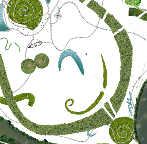
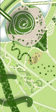
This is my current redraft and render. While the core of the design remains the same, I believe I’ve created a more refined and sophisticated space. The sight lines now emphasise key areas of the site, while also directing attention to notable surrounding buildings outside the design. Of course, this is still very much a work in progress. I’ve already spotted a few errors, along with tasks that still need to be completed.
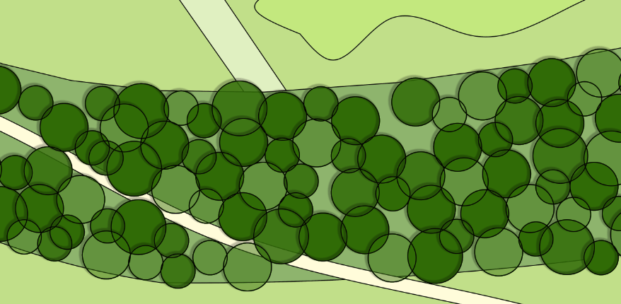
One area I’m focusing on is the development of shadows. I’m experimenting with both drop shadows and a paintbrush with 0 hardness. The shadows on the mounds are coming together nicely, but I’m having trouble getting the drop shadow effect to work as I want on the trees. I may need to paint those shadows in manually as well.
Another issue I’ve noticed is that I didn’t import the image to fill the entire page, which has caused some discrepancies along the edges. Stretching the image might mess with its scale, or perhaps it was already misaligned when I brought it in. Either way, I’ll need to fix that to ensure everything aligns properly.
Regardless of its imperfections, I am much happier with this design and render, and now I can refine it to create a more polished final image.

Leave a comment